![]()
Plum Digital > Solutions Menu > Data Sheets > |
 |
 |
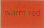 |
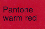
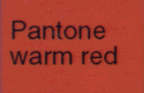
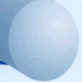
All three above were generated from the same file. The first was printed on a Kodak 1550 color copier with a Fiery RIP, the second on a Kodak XL8600 dye sublimation printer, and the third was output to an acceptable 4x5 transparency and printed as an 8x10 photo. They were all scanned at 300 ppi.
As you can see, the colors and density are very different. Even the text, which should be black in all three, shows up at different line weights as well as colors. The laser copy has hard edges - dry toner grains on rough paper, the dye subs edges are soft - vaporized dye attracted to the surface of a slick photographic paper by their static charge. The photograph cannot hold hard edges at all - chemicals distributed across the paper surface react with the chemicals in the liquid baths to produce the image.
Another factor; in print color is laid down as the print heads or rollers contact the surface. In photography color changes affect the entire sheet and there is no way to prevent the fuzzy transitions that create continuous tone images. There is a special type of high contrast black and white paper referred to by names such as imagesetter paper, RC paper, or Kodalux, that CAN produce very sharp edges, at the expense of any gray tones.
This is from another part of the photo print scanned above. The three versions of this segment were created in PhotoShop and re sampled. Although each is 72 ppi here, the details shown represent the resolution:
At 300 ppi (notice the red "linter," the relatively sharp edge detail, and the smooth blend.)
At 200 ppi (red artifacts are beginning to appear in the blends)
At 100 ppi (the lint is blurred, the edges are soft, and the blend is starting to show banding and more color shifting.)

The samples below are prints from the same Illustrator file. The first is on a 300 dpi laserwriter on paper and the second is a 2400 dpi imagesetter (aka linotronic) paper print.
 |
 |
It would be virtually impossible to tell what lines were thin and which were heavy on the laser print. More importantly, the thin lines are in slightly different locations in relation to the other lines due to their weight.
In type the line weights are even more important. Text down to 4 point can be readable if the resolution and output support it. The first sample is from the same 300 dpi laser and the second is from the 2400 dpi lino.
Sandra Ragan © 1999
* hardware and software
| NOTE: Many publications make the assumption that you are going to use your images for some sort of offset press system. For the web and photographic film, the rules are different. |
The images and data on this site are the property of sandra ragan/plum grafik, clients thereof, and others as noted. Please respect their hard work and creativity by following the "Golden Rule,"
|
Webmaster: webmaster @ www.plumdigital.com. Thanks.
![]()
Plum Digital > Solutions Menu > Data Sheets >
RETURN TO Plum Digital Doorway
![]()